Data, Reporting and doing what’s right

Data is being used to showcase that vaue has been generated. In order to do this, the most beautiful reports have to be eeked out. Now if you are a follower of Avinash Kaushik and don’t like data pukes, then you would be aghast at some of the reports that agencies in India tend to dish out.

I was, and 13 Llama Interactive was born out of that need to do better at both data driven marketing and reporting with transparency.

The road to hell is paved with good intentions

If you’ve been providing paid marketing services to clients for any extended period of time, you know that every person you work with has a different level of online marketing knowledge. Some people might be experienced account managers, others might know basics, while others still might not know the industry at all. It can be easy…

via 5 Agency Reporting Tips to Prove Your Value to Clients — WordStream RSS Feed

Apparently “agency reporting” is a thing. This is where every week or every month, the agency that is handling the brand account (or the performance account if you may) sends across reams of PDFs (or excel sheets) that’s meant to prove that whatever hair brained plan that they had cooked up the last period has worked.

The most common method to justify existence is to keep throwing boatloads of data reports from all tools and then talk about worthless metrics. Each of these tools mentioned in the article that I have shared helps agencies do this at scale, effortlessly.

Is too much data a bad thing?

It can be. If all that data is leading to Analysis Paralysis … or if it leads to falling in love with data analysis itself and forgetting real business outcomes (the reason why you got money for funding the collection of all that data).

If no one is using this mountain of data for solving problems, then it’s better that the data not be collected at all.

Yes, you are letting go of possibilities, but so be it. The damage to the business by wasting resources on gathering more liabilities instead of assets is much worse.

That’s what creates a paradox. Should we or shouldn’t we collect data?

Here’s a great video from Superweek that makes the case pretty well.

Data the new Oil

Any analysis team would work day and night to justify the reason for their being. There are enough articles being shared on the internet on arriving at a Return on Investment for Analytics (RoIA). However, the main service that any of these teams did was to crunch business data into A-has. This hasn’t changed over the years, and a lot of analysts derive job satisfaction through this very hunt for the A-ha! from their audiences.

The switch to being a core business

Data and business analysis was until now a support function, which needed business data in order to thrive and be effective. Aside from very few models (those that sold business critical data such as ratings, organizational data, etc), the data was never used as the primary product.

There was always a pre-activity and an analysis activity for that data to be useful. However, over the years I am seeing that has changed. Data is now being presented and sold as the main product.

Data as the product

Those of you who know Bloomberg, Hoovers, S&P or CRISIL, would know that data as a product business model works. Now that you know the pattern, let’s take a look at how this business model works.

Data collection as a ancilliary service

There is one function of the business which works with the entire industry it is catering to, to collect data. This more often than not is made available as a freemium or free service.

Some examples of this would be – Alexa Certified metrics, Google Analytics, Walnut app, Swaggerhub, etc.

You get the general idea here. If a good product or service is offering you a free plan, more often than not the data you are entering on that platform would be mused for multiple usecases. Not just for your primary use case.

Data aggregation and visualization

This is akin to the marketing function, and most probably gets a lot of early adopters talking good things about the product.

E.g a blogger singing paeans about Google Analytics, an industry benchmark visualization being shared, data report about a competitor, etc.

This way, the inherent value in the data is presented.

Data access and pricing plans

This is how the business is monetizing the data. By selling access to it. Often on a pay per use basis, or a per data point basis. Note, there might be multiple reports given to the user, however the user has to do the analysis on their own.

E.g SEMRush, SimilarWeb, Alexa, etc.

Wait, these are all old products

Yes. They have been around for quite some time. However, I am seeing that other industry are also copying this model. I recently spoke to someone in the pharma industry who was selling aggregated prescription data to pharma companies.

The credit industry has already been doing this for so many years. TransUnion is a perfect example. In India, most working professionals are familiary with their CIBIL scores. What few people realize that CIBIL is a TransUnion company. Similarily, CRIF score (which is an alternative bureau) belongs to Experian.

What gets my goat in this scenario, is that the firm which is collecting data is based out of another country! This firm now claims to own and know the data of citizens belonging to another country.

Shut up and take my data

Let’s go back 300 years or so. The British killed the Indian textile industry by mutilating the weavers who used to make cloth. Then they bought the cotton and other crops at throwaway prices, that cotton is similar to the data that is being collected. The industry grade cotton which was then imported back in India is similar to the data aggregation and reports that are being sold.

The only difference is that 300 years back, we were scared of the East India Company. This time around, we are welcoming the data traders with open arms. Should we not be a bit more aware of who and how our data is being used?

The reason why EU is taking such a harsh stance with GDPR is a bit more clear. Where is the call for privacy and better data sharing protocols?

Blind spots in Analytics

April 10, 2018. Dark social, even though we can’t see it or know what it is, is here. And we should fear it.

via Dark Social is Dangerous — Gareth Roberts

Read through the post, and realized that the title is a bit off. It’s not that Social Media is sending some dangerous traffic, but that the traffic being sent is being incorrectly measured as Direct traffic and therefore, difficult to act upon. This misdirection can lead to a lot of tactical mistakes.

What’s more interesting is the story about World War II that Gareth has nicely illustrated. The deaths due to a D-Day rehearsal were more than D-Day itself. The reason behind this is people coming to the wrong conclusions because of the data made available.

A light skim of this article might put me off Social Media as a marketing channel. As it is I am a bit biased against it, but this would have put the final nail in the coffin. However … this is the blind spot that I am referring to.

Slight misinformation, and there we go jumping to the wrong conclusions. As an analyst, something that you might want to keep in mind is the quality and the veracity of the data that you analyze.

18 months down the line, what has Google AMP really achieved

In early 2016, Google launched Accelerated Mobile Pages (AMP) for publishers who wanted to have their content loaded in a flash on mobile devices at a much faster rate.

At the point of writing this article, 65% of all traffic in Asia (and this is higher for developer countries) is on the mobile. A bulk of these users are on mobile data networks which may not be as fast as a steady broadband connection.

What Google did therefore was to launch a series of initiatives, Weblight and now AMP that would help the search engine load the publisher’s content faster for the user.

Google is focusing on the user

The rationale that Google gave to publishers was that it focused on the user’s experience. If a user is doing a Google search on a choppy data connection, the search results might be presented in the blink of an eye, however, because the publisher’s site was taking too long to load, the user would get a bad experience … or worse, the user would say that Google is too slow!

With Google Weblight, what the organization did was to load the content on an interim site (which was Weblight) and display the content there. This created two problems –

  1. Publishers lost traffic, and Ad Revenues
  2. Publishers lost control on the format of their content and their style guides

Both reasons were strong enough for a lot of publishers to stay away from Weblight.

AMP gets introduced in the mix

To give some control of the content formats back to the user and also to incorporate both analytics and ad scripts into the publisher’s content, Google created another mark-up language. This is AMP.

AMP allows the publisher to present the content on their own site, in a style that’s acceptable to the publisher. It may not have too much flexibility, but at least the publisher is free to design that style instead of the Weblight approach.

This may not be an ideal situation, but atleast it ensures that users are shown the content they are search for the fastest.

Have people embraced AMP?

Well, it’s a bit hazy there. For those of us who were on existing Content Management Systems (CMS) such as WordPress or Joomla it was much easier to transition. It just meant having to install some plugins and do the configuration.

However, the folks who have made their own web apps and products, they are completely clueless as to how to go about implementing AMP.

The sad part is that a lot of the product developers that I have spoken to, are of the opinion that AMP is just a new thing that “SEO folks” have to do. Add to the mental model of SEO being perceived as a much lower the value chain task – that pretty much means that developers are simply not aware about the benefits of AMP.

What irks me is that people’s individual bias is used to mask their ignorance about how to make their products perform better on search.

So, if you are leading a product team or are working on building products, then definitely head on to the Accelerated Mobile Pages project.

As a publisher who has embraced AMP, how does that impact me?

It surprisingly does not help me much with acquiring more traffic. The website is shown a bit differently in the search engine results, and that perhaps is getting me a bit higher click through rates. However, the numbers are not significantly high enough for me to assess based on the data provided.

One major problem with all new initiatives that Google is doing with Search is their stubbornness on keeping things completely opaque.

Not a single publisher is in the loop when it comes to knowing what was the exact payoff of any of the optimization activities they did. It is left for these teams to dig in and figure it out themselves before they are able to attribute the success of this activity. I believe that’s a major deterrent for a lot of product managers to make this choice of embracing AMP.

The web is not Google

I am coming back to this post after 6 months, found this on the internet – the AMP Letter. This is pretty much what I wanted to say about how this is shaping up.

Data anomalies in Search Console

In the past 5-6 years or so, a lot of online businesses, especially the ones who are hungry for growth have relied on organic traffic as one of their key sources. Now growth could mean an increase in pure numbers (traffic, sessions, users) … or it could mean an increase in more tangible business parameters (revenues, profits). One of the things that I have learnt is that depending on which success metrics we chase, our own identity undergoes a shift.

Search as a major source of traffic

The major contributors to organic traffic are search and social. Wherever there is a site which has great and unique content by the loads, there is a chance for driving organic traffic.

At different points in time, I have been skeptical about Social Media and me-too posting that most brand pages do on platforms such as Facebook. However, Search for me has always been fascinating and I still have faith in Search :).

SEO can’t be a method

Search Engine Optimization (SEO) has evolved over a period of time and I have blogged about it on multiple occasions. Unfortunately, the number of times the algorithm changes and the rate of evolution of what Google (the market leader in this space) construes as quality content ensures that you can’t have a steady SEO “process”.

Having said that, SEO involves a fair amount of design thinking.

The reason behind this statement is because the problem behind search visibility (and the factors that control that) keep changing. It’s a wicked problem. Design thinking can solve such kind of problems because of its test and iterate mechanism.

Data to drive Design Thinking

This is where having the correct data to decide on next steps is crucial. Having a data driven design thinking approach would entail that there are periodical reviews of what kind of data we have available to make the right choices.

Search data has always been plagued with incomplete information. Starting from the 2011 encrypted search announcement, where a bulk of the data in Google Analytics was being reported as (not set). There have been ample approaches to clarify this data, unfortunately, as Google Search goes more towards handhelds and as digital privacy increases, the percentage of data where there is clear visibility will keep going down.

This can’t be helped. What can be done is take these “anomalies” into account and factor those in while doing your analysis.

So what kind of Data anomalies in Search Console do we expect to find?

Google Support has compiled this list. They keep updating their data reporting logic and keep updating this page as well.

One of the major changes that you can see is that last month, they started reporting more data in Google Webmaster Tools. Please bear in mind that this is just a change in the data that is being reported and not the actual search traffic that is on your site.

The link also explains why there is data disparity between Google Analytics and Google Webmaster Tools and any other third party tool that you could be using to generate keyword data.

So, my data is incomplete, what to do?

Don’t panic.

Work with the list of data anomalies and identify which ones are impacting you the most. Having visibility on which parts of data are not available to you is also better than not knowing anything and assuming that the data you have is complete.

In iterations, the first comparison is always your previous state. In both cases the data being made available to you is pretty much the same. Hence, a week on week comparison report is much more valuable as opposed to a comparison report with your closest competitor.

As long as the measures of success is on the same tool, the data anomaly should be cancelled out. Please bear in mind that for most of our data work, we do not need precise data but can work with coarse data.

A simple approach to identify this would be – if you work with charts and graphs more, then you can work with coarse data and absorb the anomalies. If you work with more than 4 decimals, then you might want to add 3-4 lines of disclaimer below your data.

Importance of Context in Analyzing data

Recently, I was analyzing some user generated data in a mobile app. The app was sending content on specific categories to a niche audience, and at the end of each content piece, there was a simple 5 star rating feedback for users to rate the piece.

The assumption that the design team who thought of this was that the feedback data was an objective metric.

Objective metric for Subjective behavior

Unfortunately, the behavior of users and how they understood the content piece is a very subjective topic. By subjective, I mean to say that for two different users, the value they would associate to the usefulness of the same piece varies.

We could always say ceterus paribus, but I would say – “Let’s not fool ourselves here”.

In the world of subjectivity, ceterus paribus doesn’t exist

There could be so many factors that are associated to my giving a 5/5 to a piece v/s 4/5 to the same piece, that in the end, I’d be forced to say it depends, and then list out of a whole new set of variables.

Slicing the Data with new variables

This is a problem. Since, my existing data set does not have these new variable. So, from analyzing – now I am back to collecting data. To be frank, there’s no end to this cycle … collect data, realize that you might want more data and rinse, repeat.

Where do we divine the new rules and new variables? We start from the context.

Ergo, the simple and freeing approach of the answer to the questions we were looking for in the data, sometimes lies partially in the data points, and partially in the context.

Let me illustrate this

Let’s take a fairly popular metric – Bounce rate.

Now, if I were to say that my website’s bounce rate is 100%, what would you say?

Sucks, right??

.

.

.

Now, if I were to tell you that my website is a single page website where I want my users to watch a product launch video. That bounce rate suddenly pales and aren’t you itching to ask me about the number of users who played the video upto a certain point?

If you have been working with Google Analytics, then some of you might even suggest that adding a non-interaction event in GA when the play button is hit.

One more example

Let’s take one more metric. Pages/Session to measure how much content the user is consuming on a site.

.

.

.

Let’s see this in a different spiel. A user is on your site, searching for content and is not able to find what he wants, and keeps visiting different pages. After going through 8-9 pages, he finally gives up and leaves the site. That 8.5 as pages/session now doesn’t seem that sexy now does it?


Understand the context

Therefore staring at a pure data puke may not help. Understanding the context under which that data was collected is as important as going through excel sheets or powerpoint presentations.

TL;DR – Data without context is open to too many interpretations and is a waste of time.

Using Data Studio to create beautiful Reports

In the month of November 2016, Data Studio was made available for all users in India. The product was launched quite some time back, however, it was only accessible in the US and for premium Google Analytics 360 users.

However, as of today, anyone can use Google Data Studio to create dazzling reports that can be shared with teams and clients.

So how does one go about creating awesome reports?

That’s where Data Studio shines, it allows users to create one template which can be utilized across multiple data sources. I tried to create a quick report using one of the default templates provided, here’s a step by step guide on using Data Studio to create reports.

An update: As of 2nd Feb 2017, Data Studio has been declared a free product for everyone to use.

Adding a Data Source

First, we need to add our data source (in this case my site’s Google Analytics account) to the Data Studio.

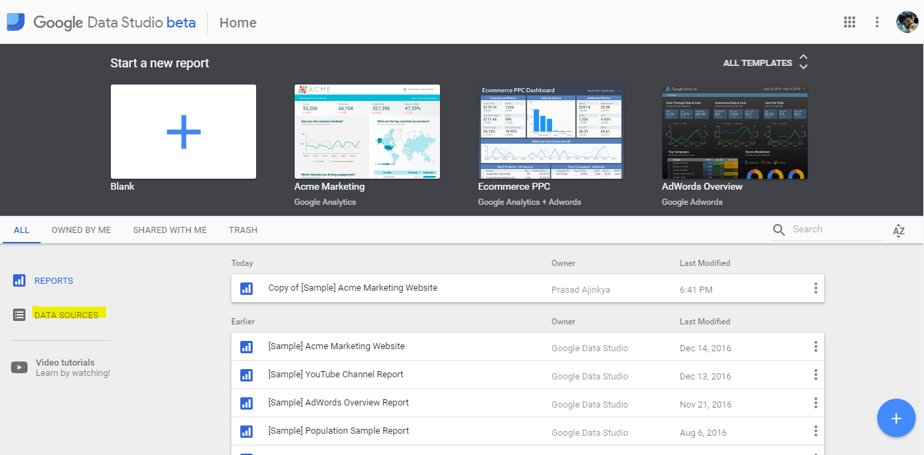
Choose the Data Source menu from the Dashboard

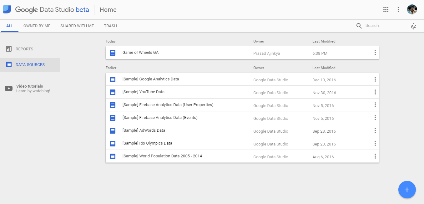
Once you click on the menu, you would be directed to a screen listing all the data sources that you have added to your account.

Note, by default Google keeps some data sources in your account, so that one can practice on the product before moving on to your own data sources.

List of Data Sources

As all Google products, you can see the clear use of Material Design in this interface. Use the blue floating action button at the bottom right of your screen to add your own custom data source.

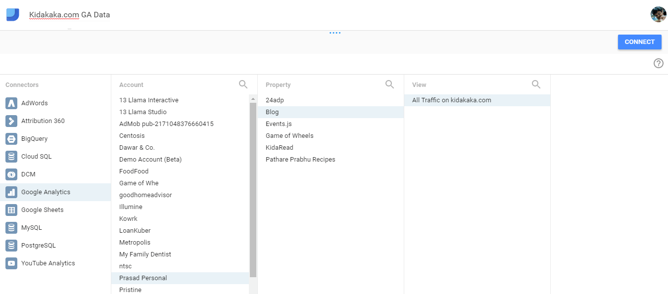
Connecting GA as Data Source

As the screenshot above shows, that most of the Google products can easily be integrated to this product. What’s more you can even use a MySQL database or a Google Spreadsheet (Excel ahoy!).

So, I could do most of my number crunching in existing styles, and use this tool only as a slick presentation layer.

After I press connect, this GA property of my site is now added to Data Studio as a source of data.

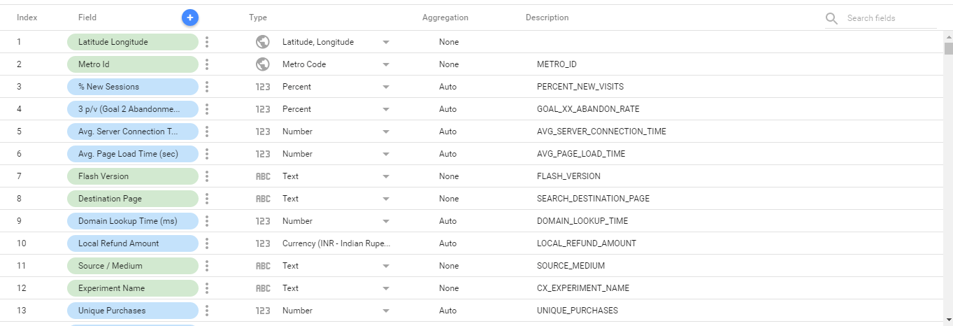
The minute you choose the right property, you would see all the dimensions and metrics that Google Analytics has. This is a pretty exhaustive list and you can import most of these into Data Studio.

GA Fields Imported as Dimensions and Metrics

Now that the important fields are linked (do check the respective fields you want to pull), we can go on to using a report template.

List of my Data Sources

The screenshot shows the recently added data source. Great! We are all set to creating awesome reports!

Using Report Templates

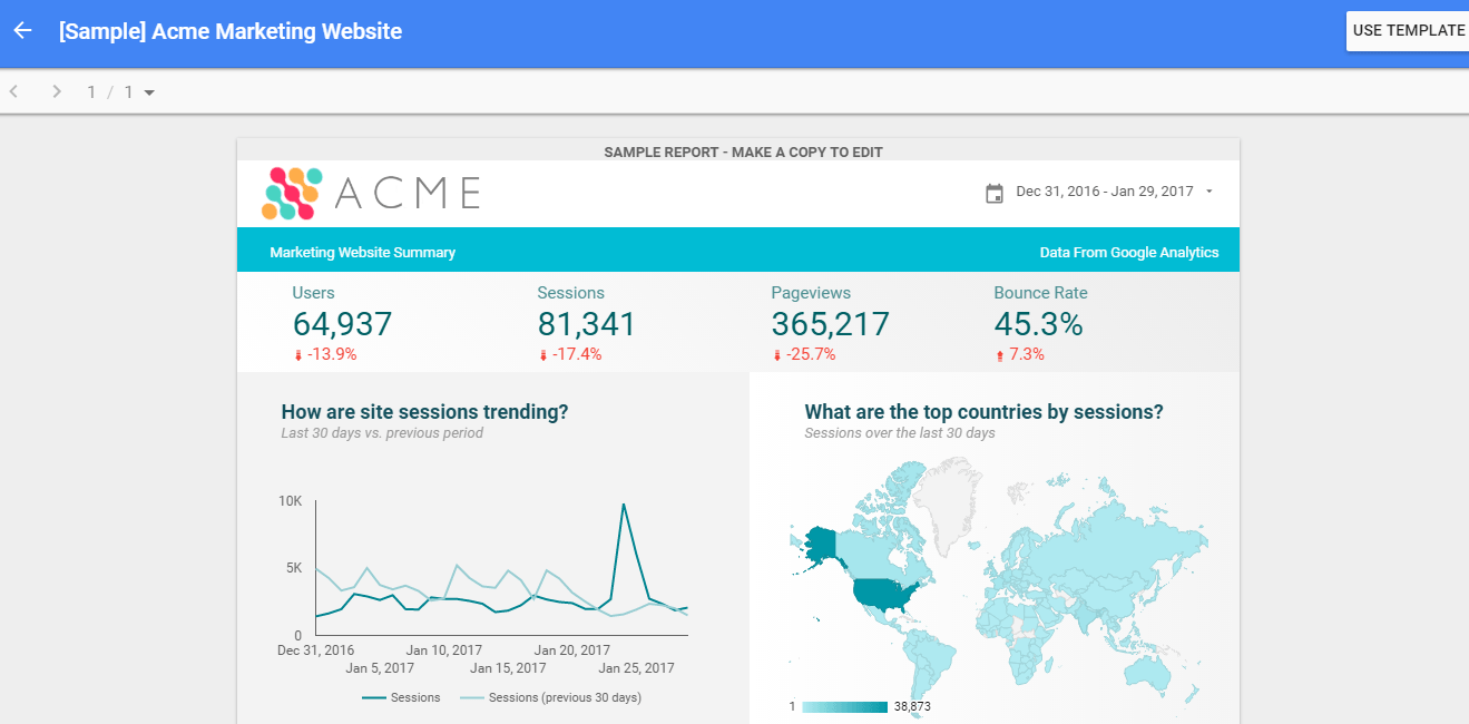
We would be using the Acme Marketing template that’s there in the account. It broadly shows basic user level data in one simple report.

Keep in mind that Data Studio reports can span across multiple pages, but for this guide we are sticking to a one-pager.

Go back to your dashboard and choose the Acme Report template.

Acme Data Studio Template

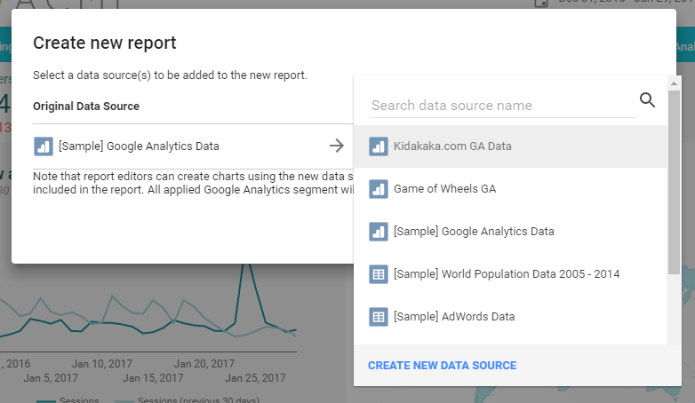
Click on the Use Template button, and now this is the most important point when it comes to using Data Studio report templates, choose your own data source.

Selecting the right Data Source

Something for beginners to keep in mind again, is that if you choose the wrong data source (for e.g. of the default ones provided), then the report would be generated, however the data won’t be yours!

If in case, you have done this, it’s easy to change the data source after you have created the report.

Let’s move on to customizing the report


Customizing the Report

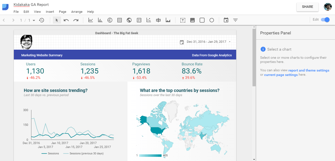
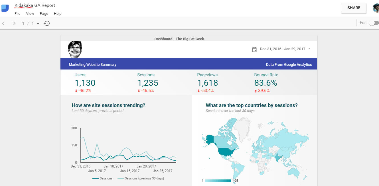
What I did was choose the Acme logo, and change it to the Big Fat Geek logo! A small change in the header color, and I have a branded look for the template.

This is what the finished report now looks like –

Finished Report
Finished Report

Using Data Studio

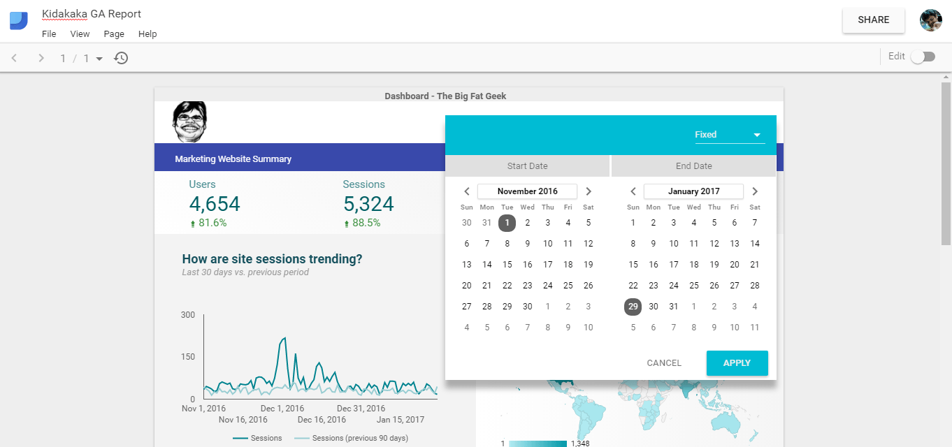
The cool part of Data Studio now shines through. What I have is a report which talks to data in real time. So I can change my data range, and my report updates!

This report can now be shared with my team or my reporting manager or clients without worrying about giving access to all the dimensions and metrics.

Data Studio Working Report

That’s all for today folks! It’s your turn to go and try out this tool and churn out spectacular looking reports.