I wanted to explain to a set of interns how remarketing in Adwords worked. An hour later, I realized that had I chanced upon this infographic by Google earlier, it would have saved my time!
Tag: infographics
Google Analytics launches one more course
Google Analytics blog came out with a brilliant new post which every marketer should read. This at the same time when they launched their new course and a shiny new infographic to go alongside. I have included the infographic on this blog, however do follow the link, it should convince you to sign-up for this course.
For students or career seekers, these courses are a god send since they also provide you with a certificate. Do not miss these courses folks!!
Ubuntu completes 9 Years
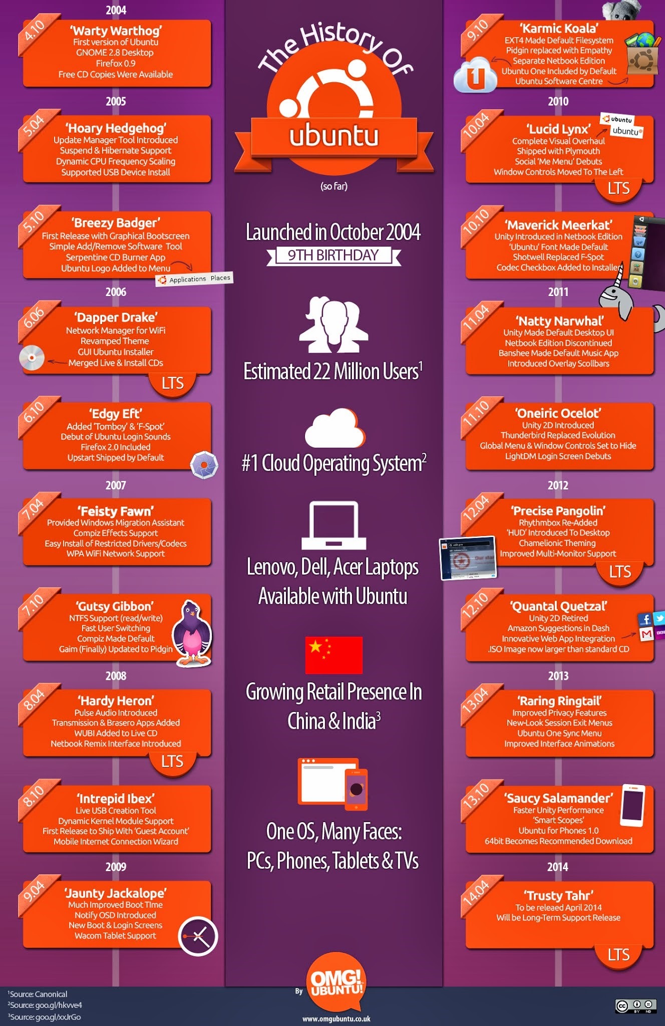
OMG Ubuntu released this beautiful infographic, which talks about the history of Ubuntu … I have literally grown (yes, even my waist) as a person when working with Ubuntu. Here’s a look back at the history of Ubuntu.
I have been using Ubuntu since 2004, when I only used to flirt with Linux. What tickled me back then was the Ubuntu was afrikaans for freedom.
2006 was the first time when I stopped using Windows altogether and worked for 2 straight years on Dapper Drake. Those were the days, when I was single, was in Hyderabad and spent consecutive new years eves drinking a single malt and installing a new version of Ubuntu.
As I look back and see how working on Ubuntu has impacted me, and my preferred style of working, I only appreciate that this distro has made such a huge impact on personal computing, that its being used by non-techies to do day to day work. It is because of such distros the Linux has been touted as the future of gaming.

Why Gaming is Good for you
Visual.ly now supports Google Analytics data
I love infographics. The way they break out data into beautiful little pictures and help you understand their impact is excellent. However, it can take a fair bit of efforts to create an infographic … believe me, I have tried and used multiple tools to do this. If you are thinking of doing those from the ground up, then you are faced with challenges such as choosing the colours, typography and which data to show in what manner.
If you are design impaired like me, then this steep learning curve is bound to turn you off.
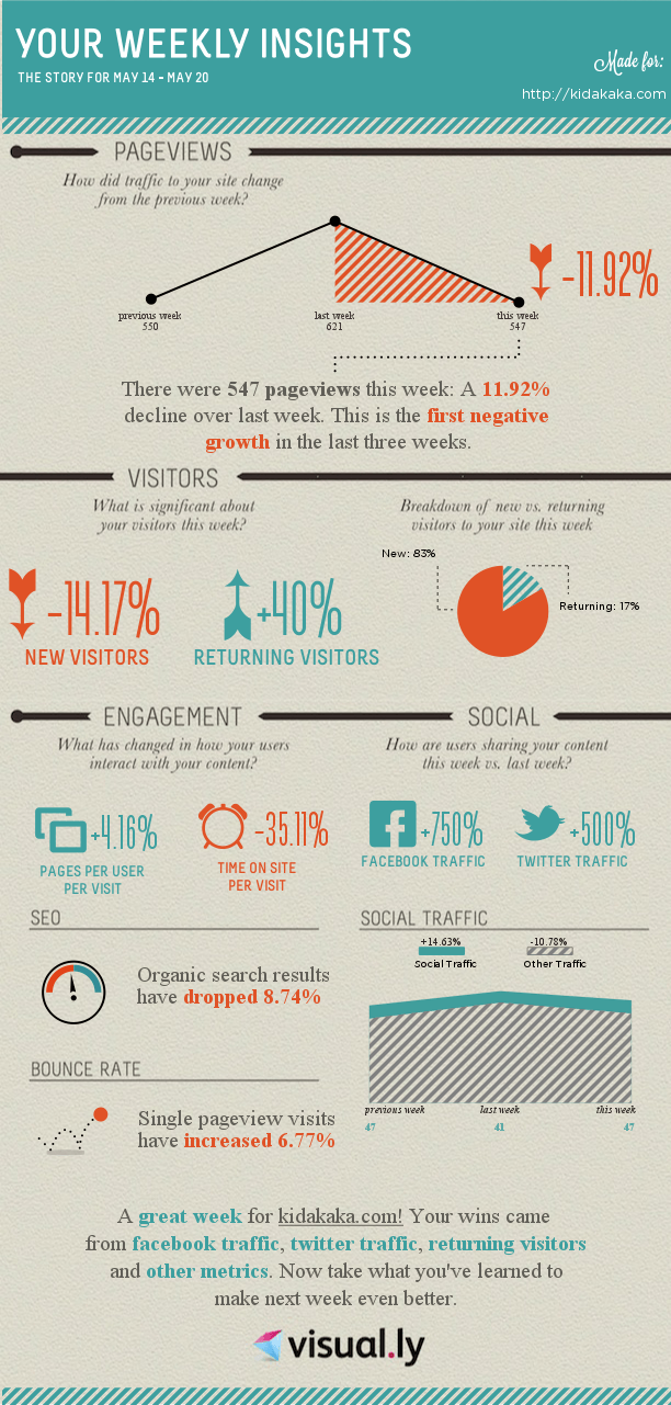
This is where visual.ly really shines through. It provides you with templates for creating infographics. Templates which have been tried and tested and make your job of creating an infographic easy. What’s awesome is that they keep releasing kickass integrations such as this one, where in you simply have to give access to your Google Analytics data and it will create a weekly infographic such as the one above.
If you are a data nerd, then you may not appreciate the findings of this report, but then you should be able to relate to some of these important points. As a webmaster and a data nerd, I am happy that the organic search results have dropped … since now I am slowly looking at other sources of traffic. This drop in organic traffic has come due to a decent rise in social traffic and that makes me a happy webmaster.


