The Slow Winter
A hilarious take on Moore’s Law. If you have studied hardware and transistors, then definitely read through this article. Do note, that it’s a PDF document. What is Moore’s Law? … well
Moore’s law is the observation that, over the history of computing hardware, the number of transistors on integrated circuits doubles approximately every two years.
5 Dos and Don’ts of International SEO – Whiteboard Friday
I had earlier written about Moz’s Aleyda and her checklist for International SEO. Last week Moz had a Whiteboard Friday with Aleyda running us through that Checklist. For people wishing to target other geographies where they do not have any presence, this is a must see video.
Six Visual Solutions To Complex Digital Marketing/Analytics Challenges
Avinash Kaushik gives simple and clear answers to most challenges that digital marketers. The explanation uses Venn Diagrams to make strong points. If you are a HiPPo (Highly Paid Person with an Opinion), then do take some time from your busy schedule and go through this. If your organization is not actively working on any analytics initiatives, then it is high time that you should start!
Sexy Up Your Marketing Data
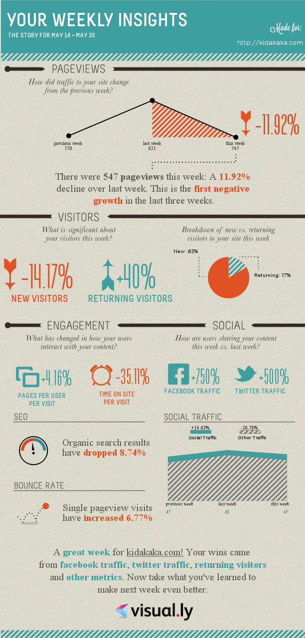
Annie Cushing shares her presentation from SMX East and drives a point home. For marketers to make sense to the top management, data visualization is crucial. People prefer looking at great looking data instead of just a series of numbers.

