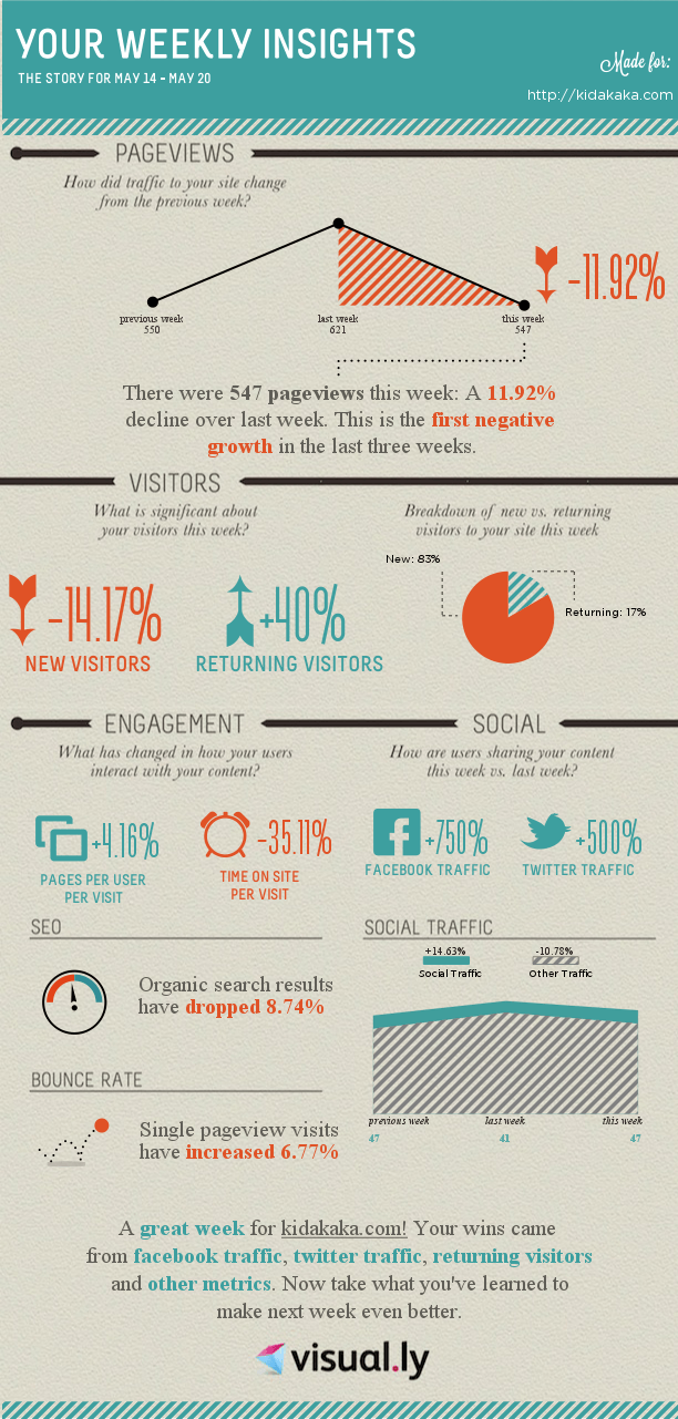
I love infographics. The way they break out data into beautiful little pictures and help you understand their impact is excellent. However, it can take a fair bit of efforts to create an infographic … believe me, I have tried and used multiple tools to do this. If you are thinking of doing those from the ground up, then you are faced with challenges such as choosing the colours, typography and which data to show in what manner.
If you are design impaired like me, then this steep learning curve is bound to turn you off.
This is where visual.ly really shines through. It provides you with templates for creating infographics. Templates which have been tried and tested and make your job of creating an infographic easy. What’s awesome is that they keep releasing kickass integrations such as this one, where in you simply have to give access to your Google Analytics data and it will create a weekly infographic such as the one above.
If you are a data nerd, then you may not appreciate the findings of this report, but then you should be able to relate to some of these important points. As a webmaster and a data nerd, I am happy that the organic search results have dropped … since now I am slowly looking at other sources of traffic. This drop in organic traffic has come due to a decent rise in social traffic and that makes me a happy webmaster.
