Disclaimer – This is going to be a slightly technical post. If code scares you, then I’d suggest you skip this one. However, if data excites you, read on fellow adventurer!
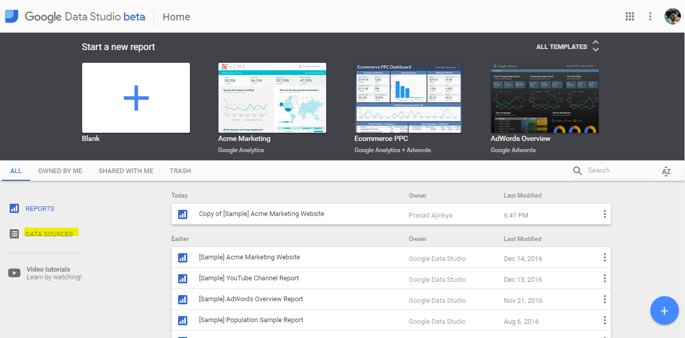
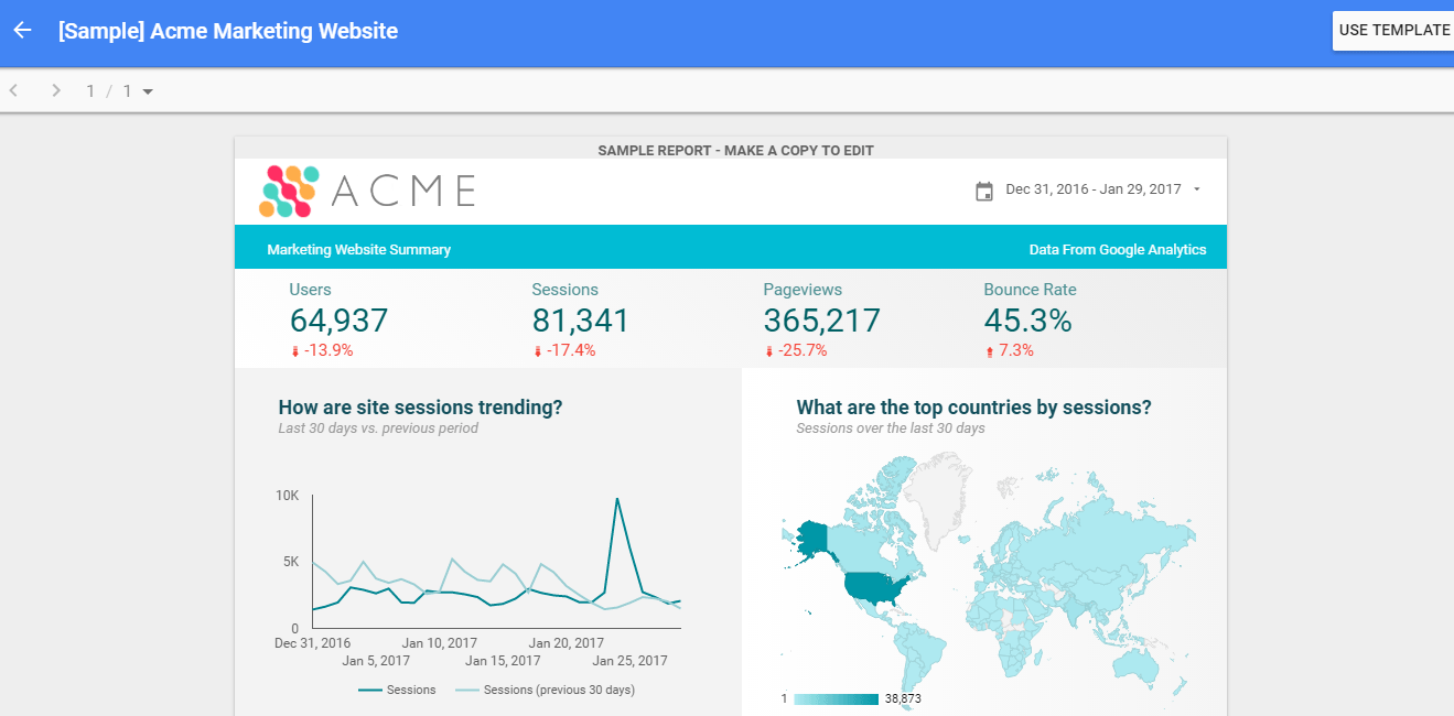
When Google launched Google Data Studio, I had written an in-depth post about how one can create dashboards in Data Studio and some of the easy to use dashboard templates that Data Studio has to offer. As the product evolved, one of the most powerful features that this product had to offer was the ability to create custom data connectors to your own datasets.
What does a custom connector do?
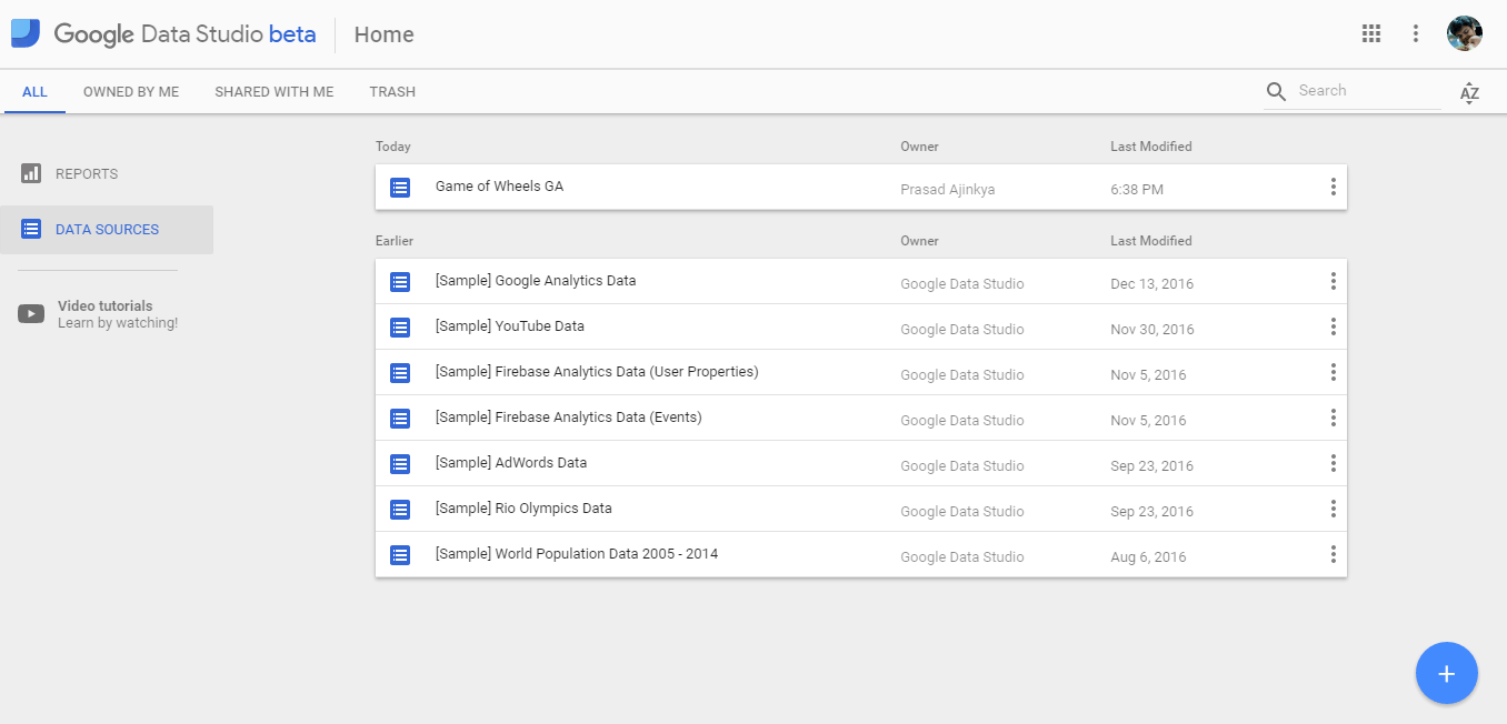
A custom connector enables a user to access their own data source within Google Data Studio. Let’s take an example of a marketing research associate who wants to present her findings. One approach she could use would be to put all that data in Google Sheets, and then use one of the in-built connectors.
However, what would she do if her data set was large and does not fit in Google Sheet or Excel? Or if her data set included multiple surveys which are inter-related to each other?
What if this data was in a database, or available as an API? This is where the custom connector for Google Data Studio works.
I wrote my first connector a year back, and I had to do some digging around. I thought that I should pen down my notes so that more people can do this much more easily. Here are my notes for the same.
Building a custom connector
Before you jump into the implementation bit, know that this is based in JavaScript and you need to be comfortable with Google App Scripts. It’s okay if you do not know this, but JavaScript is a must.
Google has official documentation on the developer site of how to build a Community Connector, this is a pretty good resource to start. It has a step by step video and instruction guide as well.
Let’s look into what makes different parts of a connector, here is a link to a sample connector code on Github.
Community Connector sections
Each community connector is a separate Google Apps script that you deploy using Google App scripts. The connector is in itself made of the following sections –
- Configuration section – This is to flesh out all the meta information about the community connector. Use this section to take any inputs from the user e.g API Secret and key if you don’t wish to store this in your code.
- Authentication section – This is to authorize the app script. If your data is lying behind a secure mechanism, then use this section to authorize the script to access the data. This supports OAuth2 as well.
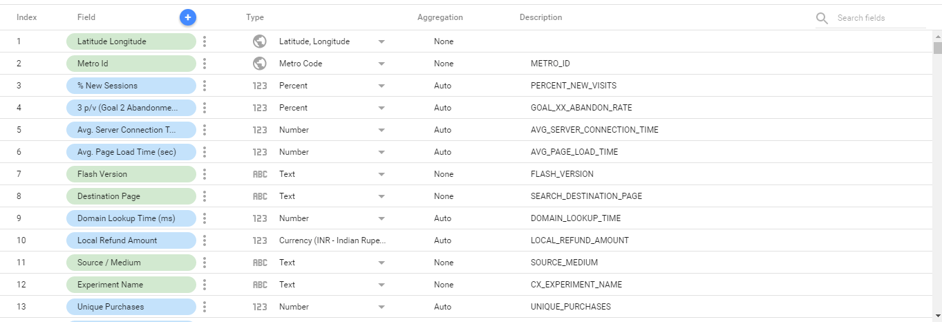
- Schema section – This is used to define the structure to the data you are importing into Data Studio. Use this section to outline which fields and what data types are they. You can also add more information on what kind of aggregation do you want this field to be have (Sum, Average, Min, Max, etc).
- Data section – This section is used to fetch the data that you are importing. Use this section for data validations or if you want to do any last minute data tweaks (e.g date conversions from string to date).
That’s all there is to it. Now, let us get into the actual flow of the script.
Connector code flow
When you are writing your connector, be sure to go through the developer reference first. In your script, you will have to include the following functions –
- getConfig() – this returns the configurable user options for the connector, this will be shown to the user when the user is adding the connector to their Google Data Studio accounts.
- getAuthType() – this is the function which is used to check if any authentication is required. If OAuth is set, then the community connector interface would check for the OAuth details
- getSchema() – this returns the schema of the data that is being access, this will be shown to the user when the data is being explored (where we can see the dimensions and metrics).
- getData() – this is the function which is used to access the data, the data format that is expected is outlined here. Normally, it is advised that the programmer write a separate function for fetching the data, a post processing function for setting up the return values, and finally call those in the correct order in this function.
Do note, that these functions will be called in the same order as they are listed. As long as you have these functions in your code, you have a functioning connector. Once you have this, you will have to deploy the code.
That’s it. Now, add this community connector to your Google Data Studio account, and make the reports you want to!
