In the month of November 2016, Data Studio was made available for all users in India. The product was launched quite some time back, however, it was only accessible in the US and for premium Google Analytics 360 users.
However, as of today, anyone can use Google Data Studio to create dazzling reports that can be shared with teams and clients.
So how does one go about creating awesome reports?
That’s where Data Studio shines, it allows users to create one template which can be utilized across multiple data sources. I tried to create a quick report using one of the default templates provided, here’s a step by step guide on using Data Studio to create reports.
An update: As of 2nd Feb 2017, Data Studio has been declared a free product for everyone to use.
Adding a Data Source
First, we need to add our data source (in this case my site’s Google Analytics account) to the Data Studio.
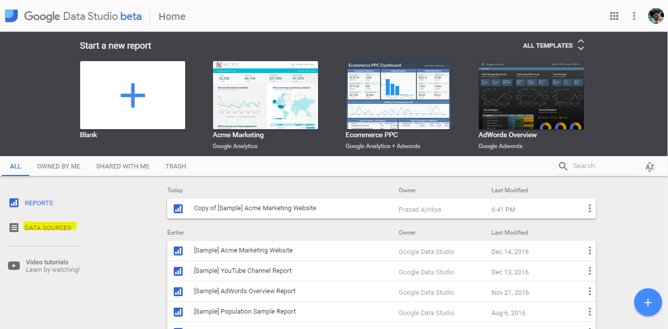
Once you click on the menu, you would be directed to a screen listing all the data sources that you have added to your account.
Note, by default Google keeps some data sources in your account, so that one can practice on the product before moving on to your own data sources.
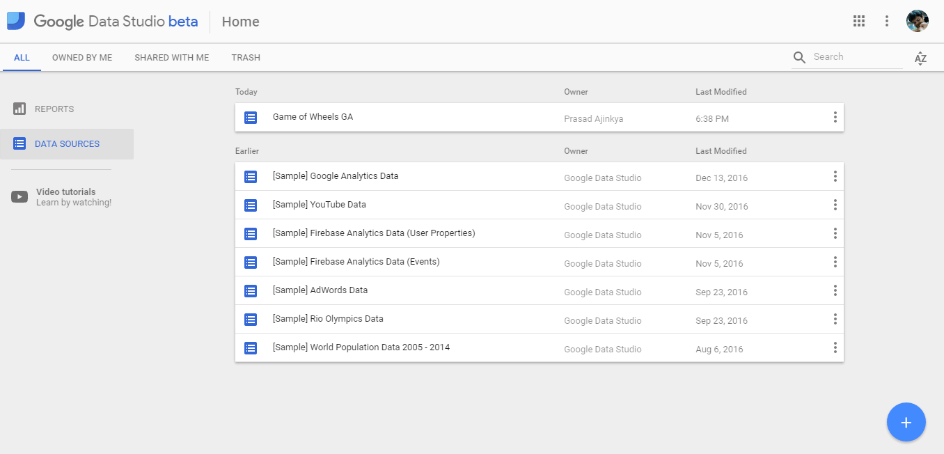
As all Google products, you can see the clear use of Material Design in this interface. Use the blue floating action button at the bottom right of your screen to add your own custom data source.
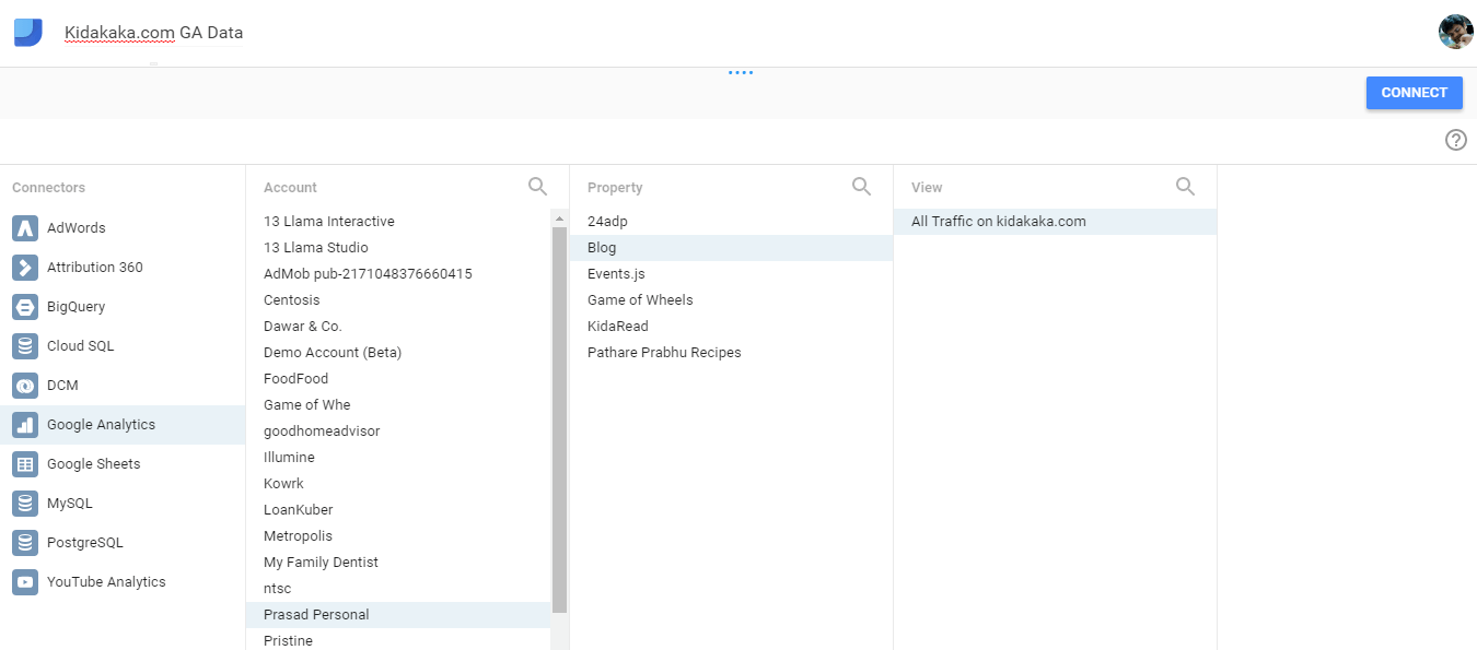
As the screenshot above shows, that most of the Google products can easily be integrated to this product. What’s more you can even use a MySQL database or a Google Spreadsheet (Excel ahoy!).
So, I could do most of my number crunching in existing styles, and use this tool only as a slick presentation layer.
After I press connect, this GA property of my site is now added to Data Studio as a source of data.
The minute you choose the right property, you would see all the dimensions and metrics that Google Analytics has. This is a pretty exhaustive list and you can import most of these into Data Studio.
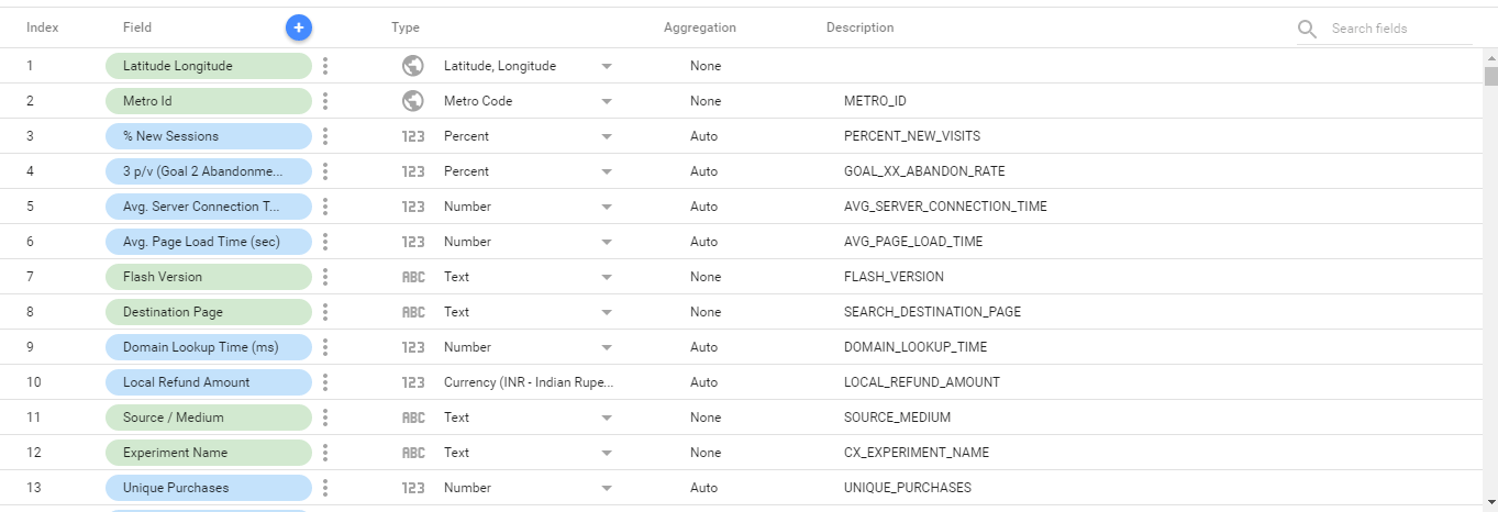
Now that the important fields are linked (do check the respective fields you want to pull), we can go on to using a report template.

The screenshot shows the recently added data source. Great! We are all set to creating awesome reports!
Using Report Templates
We would be using the Acme Marketing template that’s there in the account. It broadly shows basic user level data in one simple report.
Keep in mind that Data Studio reports can span across multiple pages, but for this guide we are sticking to a one-pager.
Go back to your dashboard and choose the Acme Report template.
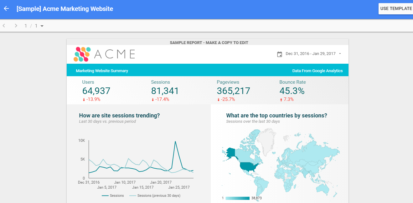
Click on the Use Template button, and now this is the most important point when it comes to using Data Studio report templates, choose your own data source.
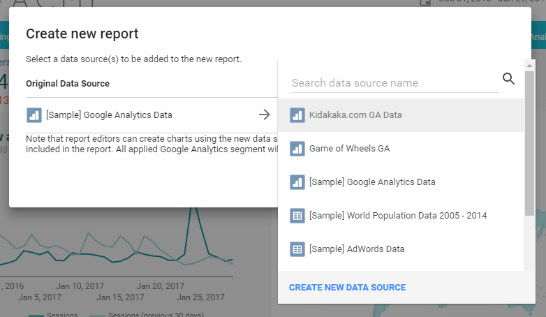
Something for beginners to keep in mind again, is that if you choose the wrong data source (for e.g. of the default ones provided), then the report would be generated, however the data won’t be yours!
If in case, you have done this, it’s easy to change the data source after you have created the report.
Let’s move on to customizing the report
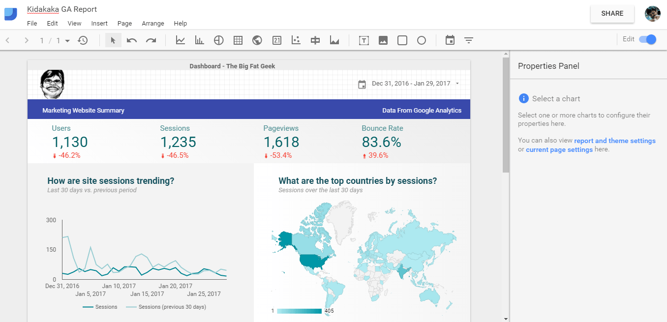
What I did was choose the Acme logo, and change it to the Big Fat Geek logo! A small change in the header color, and I have a branded look for the template.
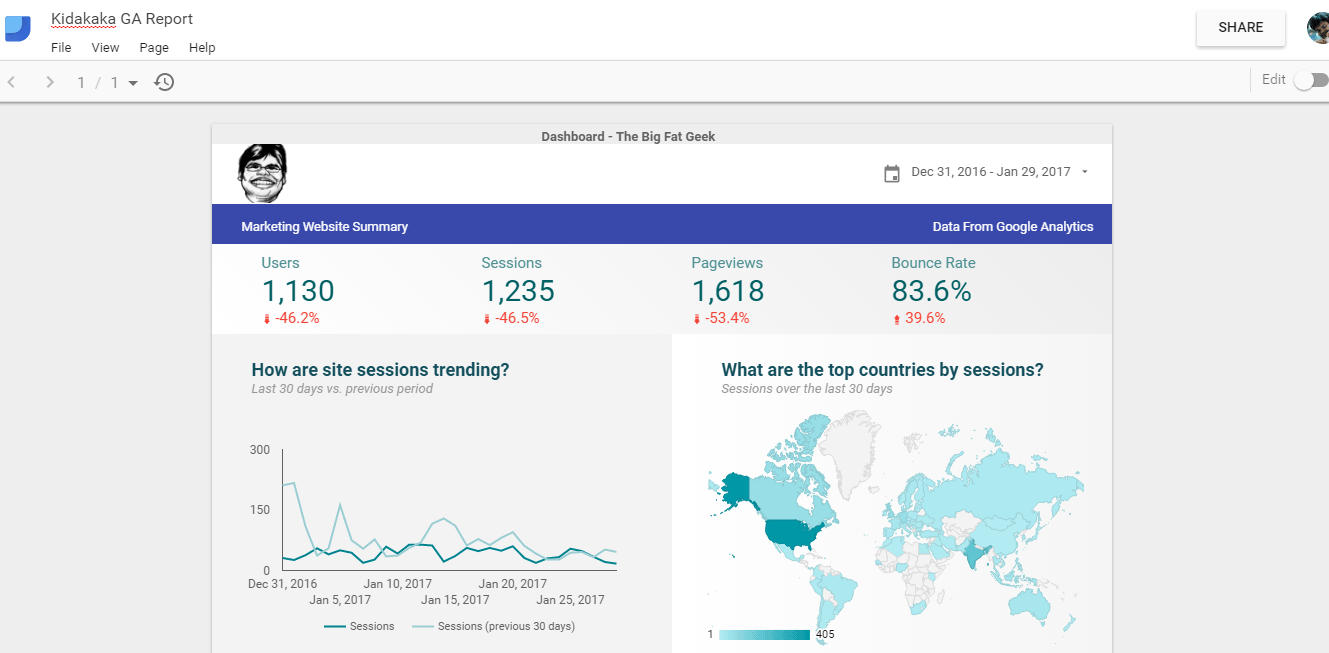
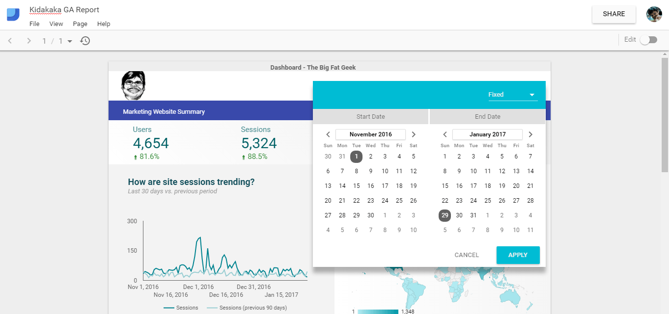
This is what the finished report now looks like –
Using Data Studio
The cool part of Data Studio now shines through. What I have is a report which talks to data in real time. So I can change my data range, and my report updates!
This report can now be shared with my team or my reporting manager or clients without worrying about giving access to all the dimensions and metrics.
That’s all for today folks! It’s your turn to go and try out this tool and churn out spectacular looking reports.
Awesome articles sir.
Thanks Rajan! If you like these, then you can think about subscribing to the blog (at the bottom, there is a form) :)
[…] तो मैंने एक गहराई से पोस्ट लिखा था कि डेटा स्टूडियो में डैशबोर्ड कैसे बना सकते हैं और डेटा स्टूडियो को […]